Case Study: Rebranding Brown and Caldwell
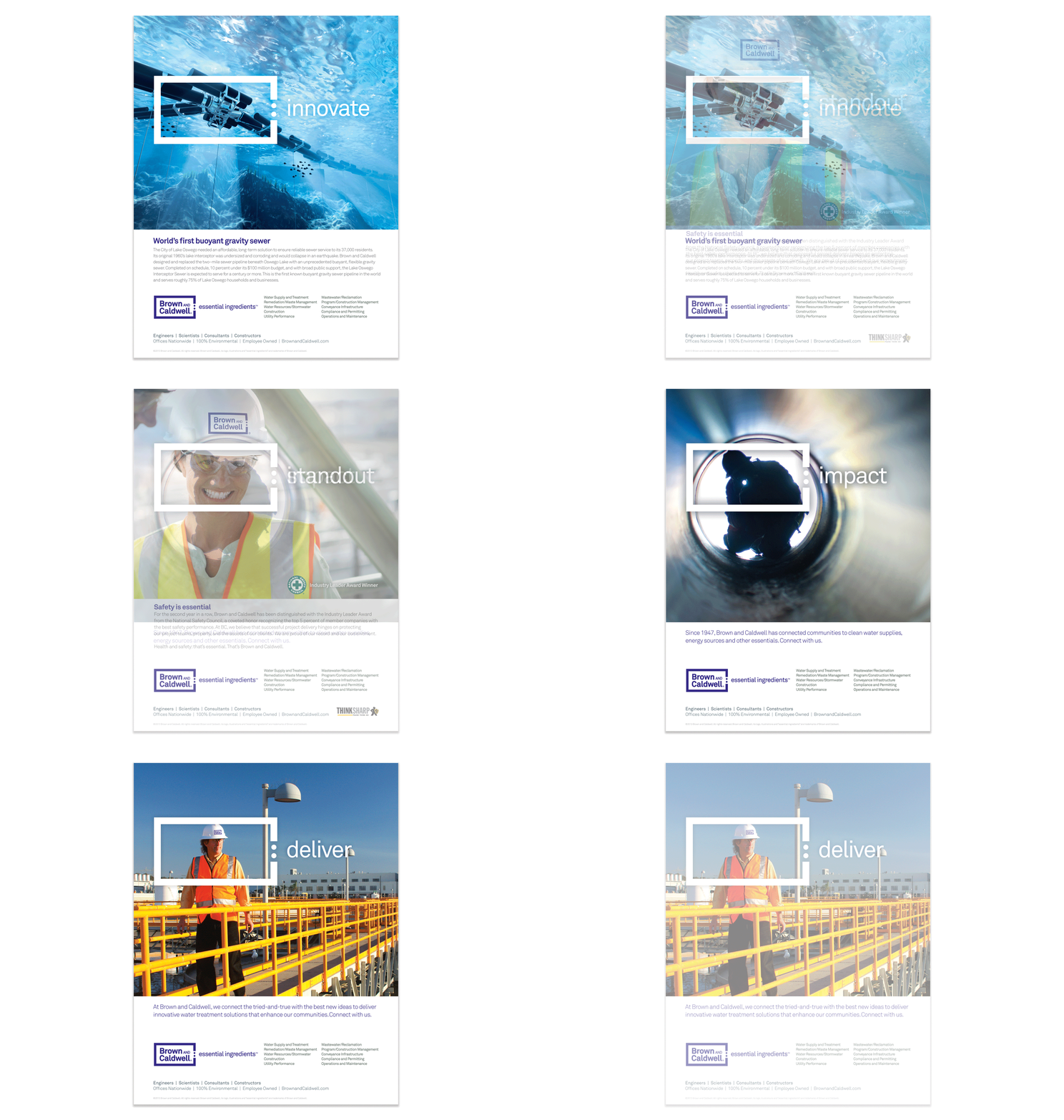
Since 1947, Brown and Caldwell has built a reputation in pioneering wastewater reuse within the environmental engineering industry. Collaborating with clients, adding value through innovation and building relationships is an integral part of the company culture. BC's campaign represents the ability to provide solutions for various needs addressing every aspect of service, Technical Innovation, Project Management, Community Involvement, and Recruitment.

Brand audit
My research began by going through the historic archive of photos and printed documents dating back to 1947.

Keeping up with the times
Since 1947, the company has shown it's resilience in the market and has remained relevant today.
Left: A 1960's photo shows founders, Ken Brown (front) and Dave Caldwell (right)
Right: The next generation of environmental engineers

Discoveries
Part of my brand audit was to collect any old hard hats as far as possible to understand how Brown and Caldwell presented their image on-site. Extensive research and discussion with employees revealed that the block was used for almost 20 years.


Competitor audit
My research revealed that most competitors were renaming their companies after the initials of their founding members while Brown and Caldwell stayed true to their founders.

Competitor color audit
9 out of 14 engineering firms were using blue as their brand color where Brown and Caldwell was the only
firm use purple.


Independent research
Qualitative and quantitative research was conducted in collaboration with Wrightbrands to understand and gauge the perceptions of clients and employees to help align the business goals and client needs

Focus areas
The research revealed 6 key areas that clients needed from Brown and Caldwell. Advanced Technical Ability, Friendly Service, Project Management, Quality Work Products, Community outreach, The best minds in the industry.

The brand experience is an ongoing cycle
Creating the BC experience required a continuous cycle of communication and feedback. This diagram was developed during a work session with the team.


Symbology within brands
Brand awareness is a key approach to my process. A brand audit of other organizations revealed the use of visual metaphors designed to support their core initiatives were strategically weaved into their branding.

Evolving the equity of the block
Months of research and brand audits prepared my team of designers on the brand redesign.
The goal was to evolve the 20-year-old block from the Brown and Caldwell logo into an identity that would provide "focus" while connecting various messages of the client experience.
The exhibits below explored various types of images that would work along with the development of the new identity.


