Brand Identity
I believe that brand identity should be relevant, beautiful, and timeless. Brands such as Coca-Cola, IBM, ABC (American Broadcast Company), and FedEx are prime examples of designs that last.

Cheetos
Cheetos was ranked as the top selling brand of cheese puffs in its primary market of the United States; worldwide the annual retail sales totaled approximately $4 billion.

Chester Cheetah
Cheetos was ranked as the top selling brand of cheese puffs in its primary market of the United States; worldwide the annual retail sales totaled approximately $4 billion.
The goal of the rebrand was to connect the Cheetos name closer to the essence of Chester Cheetah who displayed a cool yet energetic alter ego to the Cheetos brand.
Commonly known as the most recognizable mascot for the Cheetos brand, has used the slogan, "The cheese that goes crunch!" and "It ain't easy bein' cheesy" from 1986 to 1997, and then "Dangerously cheesy" from 1997 onwards.
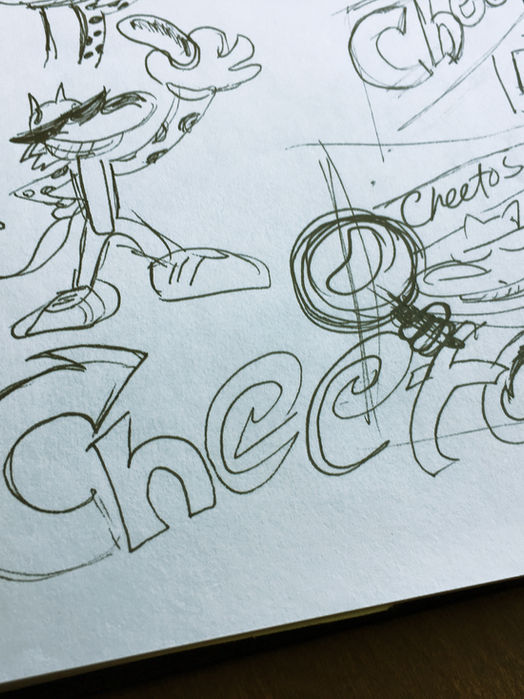
Colors, Chester's fur, and his energy was the inspiration of the logo (internally known as the "cackle" logo).
Other logos were presented in focus groups but the"Cackle" logo was loved by many within Frito-lay and the (focus) groups. The logo was first released into the Mexican market under the Sabritas brand and later unveiled the U.S. markets several months after.
Audit: Brands that stood the test of time


Iconic Brands
My inspiration came from iconic brands that have stood the test of time. Cheetos deserved the same honor as other popular brands such as the ones above.


The logo applied onto various flavors.
Sketches exploring the various ways of connecting the product and Chester Cheetah's persona.

Colosso
Identity for a heavy-duty, multipurpose salon cape. The goal was to communicate the gigantic size of the cape that can withstand the daily uses in a salon environment.


Masthead inspired by stencil infrastructure typography
Quarterly is a publication for the environmental engineering industry. The stencil was inspired by the fact that the industry works on many infrastructure projects and the typography on city streets is typically painted with stencil lettering.


